Themes from UX Scotland 2023
I was lucky enough to be able to attend UX Scotland with Tersia in early June, picking up the latest thinking, case studies and best practice from some of the world's leading design professionals.
UX Scotland, which has been on hiatus since the pandemic, was held over three days at Dynamic Earth below the inspiring backdrop of Arthur's Seat.
Many attendees we spoke to were very happy to be able to attend something like this in person, and the atmosphere was really positive and buzzy throughout.
It was also the best-organised conference I've been to in a long time.
While the keynotes, case studies, workshops, talks, and social chat were definitely broad and varied in subject and detail level, there were a number of key themes I felt came through strongly from this year's event.
Designing and building ethically and thoughtfully
A number of speakers including keynotes Heldiney Pereira and Kat Zhou were on a mission to encourage designers and tech companies to consider their purpose, services, values and missions more deeply.
Kat, who is an expert on design ethics, delivered a Nobel Prize Summit keynote earlier this year, which challenged traditional corporate strategies that are based on growth, profit and exploitation. Through her work with <design ethically> , she inspires designers and businesses to reconsider the why and the how of their activity to aspire to a model based on delivering products and services that have value.
Most importantly, she explains changes to process that can support businesses in doing this in a way which does not cause significant harm.
Heldiney Pereira's talk, which loosely focused on how he's built and maintained high-performing and diverse teams at Monzo, was interwoven with a very moving personal account of his own journey to support and mentor people of colour in the design industry.
From making a life-changing call to the Samaritans to later being elected a Samaritans branch Director and school governor, Heldiney explained how he's combined different tools and approaches to successfully empower people from diverse backgrounds to become effective, productive and equitable team members.
I came away from both those talks with more questions than answers, which I felt was a good thing! At PDMS, we often talk about the work we do having meaning and value, and it really gave me food for thought.
Inclusivity and accessibility
An important part of my role is about ensuring digital accessibility across services and websites. One of the big ticks for me in attending UX Scotland was the number of sessions that addressed some of the many ins and outs of this subject.
Andy and Charlotte from Tesco Bank's UX design team gave a great talk on inclusive design.
Prior to this talk, I hadn't really considered that inclusive design is kind of like accessibility's parent. Inclusivity is achieved not by adhering to criteria like WCAG, but by having an overarching approach to service design that seeks to enable and empower all people.
This resulting service or product would almost certainly be 'accessible' if built correctly. However, to be inclusive, you would also need to consider ethnicity, nationality, language, mental health, economic situation, beliefs and location within the design workstream.
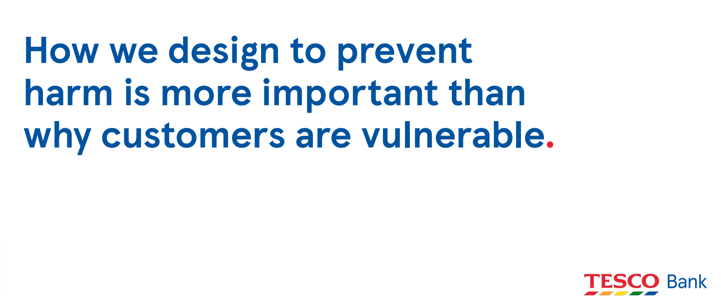
The key takeaways for me were how their research, which was partly driven by the UK Financial Conduct Authority's new Consumer Duty policy, led to working on the default basis that every customer could potentially be vulnerable in some way, rather than try to understand the circumstances behind every context:

I found their use of archetypes and personas to arrive at an understanding of how to meet the needs of vulnerable users really insightful.
I wasn't able to attend Miriam Vaswani's 'How to design content for people in crisis' but I got hold of the slides (thanks UX Scotland) and it looked like a great talk with some really useful detail and guidance around clear language to use in emergency situations where people may be vulnerable or in danger.
There were a number of other insightful talks and case studies covering practical ways to achieve inclusivity and accessibility. Tersia has put together a useful guide to the new ACPA colour contrast values here.
Communities and complexity
Kara Kane is a Head of Profession for Design at the UK's Government Digital Service and the focus of her keynote on Day One was the importance of communities of practice in delivering public services in a complex and growing organisation with thousands of services and with constantly changing policy, teams, customers and staff.
Communities of Practice is an ingredient in Norman Nielsen's DesignOps recipe for advanced design practice. Kara describes it more succinctly as the 'glue' that holds design teams together.
Her talk emphasised the 'boring magic' of delivering really good public services where the use of the service is easy and straightforward, often hiding enormous complexity and reconciliation behind the scenes: a truly user-centred approach.
Designer, podcaster and educator Gerry Scullion then challenged us to 'Embrace the complexity mindset', outlining key areas that should be considered when working with, and making the most of, complexity.
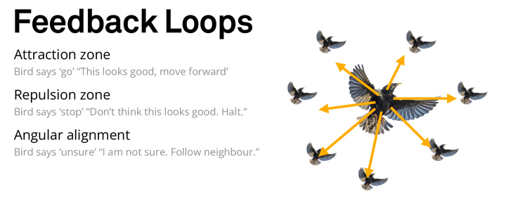
Kicking off with some very pretty (and sometimes amusing!) images of starling murmurations, Gerry's talk was an inspiring and abstract journey looking at complexity in nature. It also looked more practically about how we can accept and deal with complexity, and work with low-level randomness with more success.

Image copyright Gerry Scullion, This is HCD.
All in all, UX Scotland was fantastic and I can't think of a tougher crowd to deliver 'an experience' to than a large group of experience designers!
I definitely came away with a healthy dose of inspiration, practical tips at the detailed level and tools and techniques I could immediately apply to my work and my team's work. I felt inspired to grow personally and also focus on how to better help others.
Speaking of growth, I was glad that my gifts from Border Crossing UX survived the indignity of being shoved in a suitcase, dragged on two trains - and a plane - and are now enjoying the Manx sunshine...


