Nesta CareerTech Challenge: Sprinting from problem to prototype in four days
Our UX team recently had the opportunity to participate in a Design Sprint as finalists in the Nesta CareerTech Challenge.
The challenge aims to encourage innovative and creative solutions to big challenges in the UK labour market. Read about the challenge.
To kick off the project, a Design Sprint was the perfect way for us to begin exploring what solutions to these problems might look like, and how we might improve people’s working lives by guiding them along a pathway to upskilling, retraining and ultimately, employment.
While the terminology ‘Design Sprint’ might sound like hectic, unscientific process, it is in fact a tried and tested methodology that was created by Google Ventures to generate ideas and find viable solutions to problems through rapid design, prototyping and testing. Typically, a sprint is conducted by a multi-disciplinary team of 4-7 members, over the course of 3-5 days.
What we did
Strictly speaking, sprints should include participants with the following roles:
- Decider
- Facilitator
- Marketing Expert
- Customer Service Expert
- Design Expert
- Technology Expert
- Financial Expert
We kept our Sprint structure as close as we could to the ideal format. Sprints are designed with five intense phases intended to focus on and accelerate ideation and problem-solving: it is possible, however, to cram two phases into one day if you’re ambitious or like a real challenge!
Day 1: Mapping
Day 1 involved a series of time-limited discussions and lots of sticky note writing. The purpose of this was to map out the goals of the project and to understand the problem in its entirety by generating and documenting as much information as possible in a short period of time.
The Sprint goal was quickly identified as:
"Demonstrate how to guide the user through a series of actionable steps to transform their skills and/or occupation."

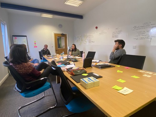
Members of the team brainstorming on Day 1
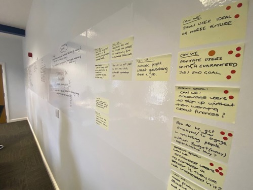
One step that we enjoyed was the ‘How Might We?’ (HMW) exercise, which involved identifying problems and then imagining possible solutions. For example, if the problem was ‘people struggle to find the motivation to retrain’, the HMW could be ‘How might we communicate the rewards of completing a retraining pathway’.
Within 10-15 minutes, dozens of HMWs were jotted on sticky notes and stuck on to the wall. The whole team was then given a limited number of sticky dots, which were used to democratically ‘vote’ on the solutions that they thought were most important (for any reason) to the objective of the sprint.
By the end of the first day, we had a clear understanding of the problem, and clear objectives set for the rest of the sprint.

Our notes from the HMW exercise
Day 2: Sketching
Tuesday was great fun, and a chance for everyone to put on their creative hats. The day was split into two sessions, Lightning Demos and Sketching.
In the morning, we spent time individually researching websites and digital services we liked for the design, features, interactions, or ease of use. After that, each team member demonstrated the sites and apps they had found in short 3-minute (lightning) demos. The purpose of this was to inspire us all for the next step.
The afternoon entailed lots of doodling and sketching. While it was good fun, there was a genuine purpose to elicit functional and usable concepts with the aim of addressing the problems/objectives identified the day before.
The sketching session was divided into a four-step process. First, we made notes about the problem, ideas we had, as well as the research we had conducted in the morning. From there, we spent 20 minutes forming our thoughts and notes into sketches of what our solutions might look like and how they might work.
During the next step, we each had to rapidly sketch eight components or variations of the concepts developed in the previous two steps. The purpose of this was literally to squeeze creativity out of us in a pressured environment.
Although it was a bit stressful, it ended up working effectively and everyone got a range of concepts on paper producing and learning something they had not considered earlier. (It also reminded me a bit of Countdown, with a clock counting down from 1 minute to 0 repeatedly for 8 minutes accompanied by some dramatic music!)
The final activity in the afternoon was a 30-minute full solution sketch over three A4 pages. This represented our view of what the site/app should look like given everything we had come up with, discussed and learnt in the first two days. The solutions were given names and pinned to what little wall space we had left, ready to review on Day 3.
Day 3: Deciding
This was the most intense day of the Sprint. Being able to think creatively for the entirety of day two had generated a lot of ideas, and we were all up for debating and questioning them.
To start the day, we walked around the room in silence and studied each of the solution sketches that were created and stuck on the wall the day before. This is known as an ‘Art Gallery’ activity. From there, we used dot voting again to highlight sketches or components we found the most valuable, and/or most likely to help achieve our Sprint Goal.
Each member of the team explained their choices before the Decision Maker applied their ‘super dot’ to decide on which solution sketch should be the subject of the next step.
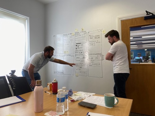
The afternoon was spent storyboarding the solution sketch chosen in the morning. This involved using a whiteboard to draw detailed solution screens that were to act as a template for the final prototype on Day 4. We discussed and debated every element on each of the screens, considering our Sprint Goal as well as the design, user experience, and any technical constraints.

Discussing solutions on Day 3
Day 4: Prototyping
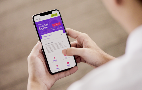
Our final day was dedicated to creating a high-fidelity prototype of the mobile web app we had gradually defined and specified over the previous three days. Adobe XD (Experience Design) was used to develop detailed, interactive screens that could be shown to test users. We used the ‘fake it till you make it’ method, putting together a non-functional but realistic design in a short period of time.
It was again intense and challenging to produce a working prototype in one day, but we achieved it and this job was definitely made easier by the fact that we had an agreed, collaboratively designed blueprint to work from.

Mobile app prototype
Final thoughts
Some start-up businesses and organisations spend months or even years trying to find solutions to their problems, but with a Design Sprint, it is possible to get some real-world insight and answers within the working week. Credit to the team for bringing their insights, knowledge and enthusiasm to achieving this.
The democratic nature of silent voting on ideas that participants like also helps ensure everyone’s ‘voice’ is heard.
Sometimes the findings of a Sprint might result in fully developing a product or service, other times it might result in deciding not to continue to invest – but in business terms not going ahead with a flawed idea can be just as valuable as pursuing a good one, as it can prevent wasted time and money.
As first-time participants in a Design Sprint, we found the collaborative approach was very enjoyable, and allowed us to ideate quickly; finding solutions to problems efficiently and cost-effectively.
We’ve produced an engaging prototype of a new product/service that will elicit valuable feedback from users, and when we fully complete user testing, we will find out whether we have found a viable solution to the employability and skills problems we identified at the start of the Sprint.

