
Creating a more accessible world: The power of inclusive design
I have absolutely no scientific basis for this opening statement, but here goes: I would bet that most organisations would confidently state (and strongly believe) that they really do put their customers first when coming up with ideas for products and services.
But how well do they know those people, really?
For example, do they know how many are elderly, blind or otherwise disabled in some way? Have steps been taken to research the nationality, native language(s) or cultural beliefs of your users? Are any of them vulnerable people? What is the variation in their financial standing, and how might that affect their ability to make a payment - and therefore how that might affect their mental health?
This is where inclusive design comes into play.
What is inclusive design?
Inclusive design is an approach, with proven techniques, that sets out to ask questions like these. The aim is to minimise or ideally remove exclusion entirely from whatever it is you are designing. The outcome is enabling the maximum number of people to understand, enjoy and have their specific needs fulfilled (and therefore be satisfied customers). And which brand - or organisation - doesn’t want that?
If this all sounds a little complicated, it’s because it is, a little bit. But then, it would be. We humans are a complicated lot, aren’t we?
Inclusive design is not new.
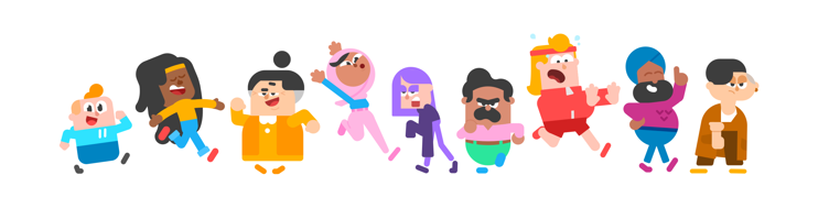
The electric toothbrush was originally designed for people with limited motor function in their hands but is now used by more people who are fully able than people with a disability.
Another example that many will be familiar with is the provision of ‘tall and large’ (or petite) sizing in fashion. You’re not designing for ‘one size fits all’. You’re building in diversity so that every customer feels like they’re equally part of something.
Inclusive design vs accessibility
Examples of inclusive design in tech have, for the most part, been concerned with accessibility. In actual fact, they are separate though related concepts.
The simplest definition I could come up with is:
Accessibility is one output of an inclusive design approach.
Building an accessible website can currently be achieved by ensuring that it meets all the criteria of WCAG 2.1 AA. This standard is internationally recognised specifically because the web consortium, W3C, took an inclusive design approach to understanding how people with disabilities use the internet. This resulted in a big list of ‘adjustments’ that can be made to any website to make it accessible.
WCAG 2.1 AA is great and as developers, we should definitely use it to build websites that meets its requirements. However, there are loads of ‘human factors’ to consider in addition to disability that you won’t really find mentioned in WCAG. These factors include:
- Race/skin colour
- Biological sex
- Gender identity and sexual orientation
- Physical traits
- Temporary disabilities, vulnerabilities, changes in personal situation - examples could include pregnancy, recovering from an operation or injury, menopause, mental health symptoms, age-related conditions
- Language
- Education
- Religious, political, and ethical beliefs and views
- Economic means
- Geographic location
You might be surprised at some of the ways these factors can positively and negatively affect the way individuals experience your product or service. Not considering these factors can in some cases have some quite profound impacts on user experience - and therefore user satisfaction and loyalty.
Some people might think ‘but that means I have to design things differently for the minority. That doesn’t make any sense, most of my customers are just average. Plus, it will cost a lot…’
Well, not exactly. In fact, there isn't really such a thing as an average customer, when you consider one in five people in the UK have some form of disability. Then add in all of the other considerations and factors from the list above.
Many of the adjustments that are made to services to make them inclusive can be carried out quite easily and actually benefit everyone, not just the edge cases. Remember the electric toothbrush?
In addition, there is a huge economic potential. By creating products and services that meet all customers’ needs, they will be more future-friendly and aligned with the diverse society that we now live in.
For example, a 2021 study by the Australian Centre for Inclusive Design found that reducing exclusion from financial services by even 25% could result in 832,000 additional customers with up to $1.5 billion in revenues created. The knock-on effects for the national economy could include a reduction of $1.6 billion in health, welfare and criminal justice expenditure.
The UK’s Government Design Service Manual also now contains notes and advisory on how to make government services more inclusive. After all, these are essential public services that must be available to everyone.
Inclusive design in action
Now we know the ‘why’ of inclusive design, what about the ‘how’? Let’s look at some real-world examples of inclusive design for digital services, starting with something really simple and within most people’s reach:
Video and audio transcripts
For anyone that has a website, providing a text version of media is a classic inclusive design improvement: solving for one, extending to many. Not only does it benefit people who are deaf or hard of hearing, but there are many benefits to be had for other users. Consider that you might want to do some eLearning in a place where you can’t hear audio because it’s too loud. Or maybe it’s a studious environment like a library or public place. Maybe you just like reading because that’s your preferred learning style, or maybe connectivity is poor or the video content is blocked by the ISP. Video transcripts can help you in all of these situations to make the content more available in a whole range of situations.
The same can be said for subtitles or closed captions. Almost all videos provide, or should provide, subtitles in order to be inclusive. As with the transcripts, the benefits are felt by those who are deaf or hard of hearing plus for watching videos on silent in noisy or public settings, for translation purposes, for increased concentration and more. In fact, a UK study by Ofcom found that 80% of people using subtitles are not deaf or hard of hearing.
Duolingo - cultural diversity
Like its 500 million other users, I’m a big fan of Duolingo, particularly after their recent redesign.
Duolingo has an excellent inclusive design practice which has resulted in some really great features and content in their language learning app.
The Duolingo characters are one of the most loved things about the platform. Diversely representative and designed in an entertaining way, they have had a transformative effect on user engagement and brand loyalty.
Even more interestingly, Duolingo’s language learning content is also subject to inclusive design. In the German learning modules, for example, a conversational exchange has one half of a same sex couple discussing the honeymoon she’s on with her wife (not her husband). This is a big improvement on the outdated modern languages textbooks those of us of a certain age suffered in the 1980s!
Pinterest, the online image sharing and collecting app, has long been an investor in inclusive design. They even compile an annual inclusion and diversity report as part of their BAU.
One standout feature that was developed by Pinterest as early as 2018 is their Skin Tone feature which allows users of different races, complexions, and skin types to filter and refine image results by the skin tone that best represents their own. The feature is of most use to beauty enthusiasts, but it’s easy to see other future applications of this kind of personalisation.
Pinterest is continuing to research and develop tech to support real diversity of its image data. The platform recently announced a first-of-its-kind technology that analyses images of body type across its database of five billion images, in order to serve up imagery that is more representative of societal body type and skin tone.
In conclusion
Inclusive design is a great way to make digital products and services more successful both in customer terms and financially. It might not be within everyone’s reach to create the Pinterest or Duolingo of the future. There are significant ingrained cultural, economic and systemic obstacles that can get in the way, particularly when it comes to large-scale public services or multinationals that traverse cultures and customer bases.
However, the first step to being inclusive is possible for many with the right mindset and just a bit of empathy. Talk to some users and try to understand their point of view and the challenges that they face. It might surprise you what you’re able to change with a little effort.
PDMS is the organiser of Design Diverse, a mini-conference about Inclusive Design, taking place on 1st December 2023.
Topics
Author
